Dashboards display a current snapshot of your organisation’s key Compliance, Risks, KRIs and Events.
TriLine GRC offers two types of Dashboard:
A customisable Dashboard Page, and
Several Interactive Dashboards with preset Panels that you can interact with to view and filter statistical information about Compliance, Risks, KRIs and Events.
Note: Dashboard Menu appears when a position is added to System Security Group ‘View Dashboards’. Dashboard Menu also appears for Administrators and Super Users.
Information restrictions in Dashboards
In both the Dashboard and the Interactive Dashboards, the data you see is restricted to what is allowable by your Position’s security settings.
Note: Administrators and Super Users always have access to all data.
The Dashboard
Each Position’s Dashboard is unique and you can customise your Dashboard to suit your own requirements.
You can apply filters and groupings to widgets in order to show data that is relevant to your position. Widgets can be resized and moved around the Dashboard to suit your preference. When you exit the Dashboard, your settings will be saved.
Interactive Dashboard
Modules with Interactive Dashboards
Interactive Dashboards are available for:
Compliance,
Risk,
KRI,
Events,
Contracts***,
Control Inventory***,
Document Library***,
Obligations***.
*** Optional Modules that may or may not be installed in your system.
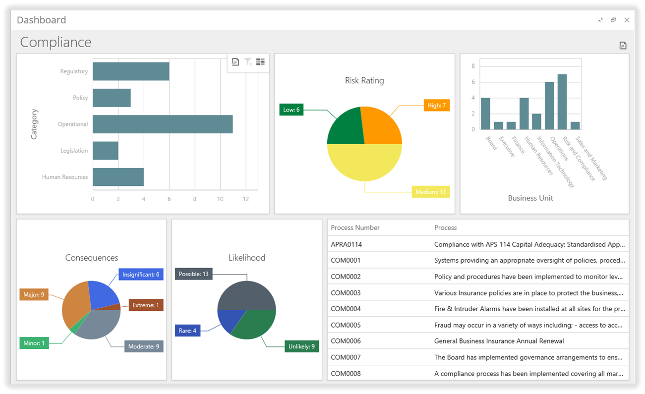
Interactive Dashboard (‘Compliance’ displayed)
These Dashboards provide a high-level overview of your system information while allowing you to drill down and examine the data in detail.
Interactive Dashboards can be exported to PDF and several image formats.
Working with the Interactive Dashboards
Accessing an Interactive Dashboard
Access any of the Interactive Dashboards via the Main Menu:
From the Main Menu, select from:
Compliance | View Dashboard
Risks | View Dashboard
KRIs | View Dashboard
Events | View Dashboard
Contracts | View Dashboard
Control Inventory | View Dashboard
Obligations | View Dashboard
Note: The menu label for ‘Events’, or ‘Control Inventory’ may be different on your system.
The selected Interactive Dashboard is displayed.
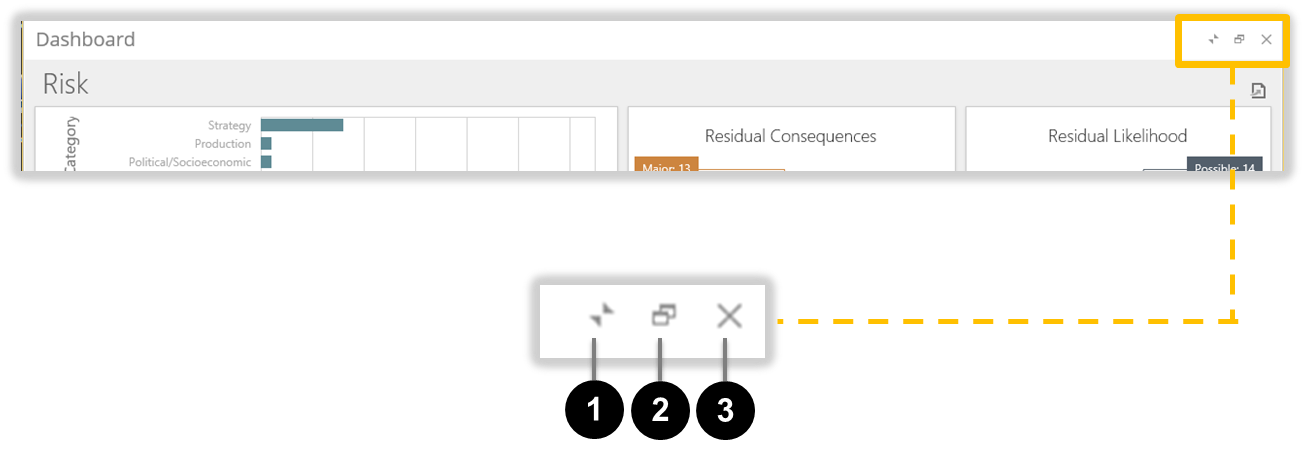
Interactive Dashboard Display Controls
When you first open an Interactive Dashboard, the Dashboard is sized to fit the entire browser window.
You can use the Dashboard Display Controls located at the top-right corner of the Dashboard page to vary how the Dashboard is displayed.
The Interactive Dashboard Display Controls)
Interactive Dashboard Display Controls
ID
Element
Description
1
‘Minimise Display’ Control
Click this control to ‘roll up’ the Dashboard Page to reveal the underlying Page. Click the control again to return to the Dashboard Page.
This control is useful if you need to check information on other pages without closing the Interactive Dashboard.
When minimised, only the ‘Dashboard’ title bar and Display Controls are visible at the top of the browser window.
2
‘Maximise Display’ Control
Clicking this control toggles between sizing the Dashboard Page to fit the browser window and reducing the size of the Dashboard Page to ‘float’ over the underlying window.
You can click and drag the the edges of a ‘floating’ Dashboard Page to adjust its size.
3
‘Close’ Control
Click this control to close the Interactive Dashboard.
Interacting with a Dashboard
The basic principle of interacting with a Dashboard is this:
Click a value on one Panel, and
The information shown on all other Panels is filtered based on the value that you selected.
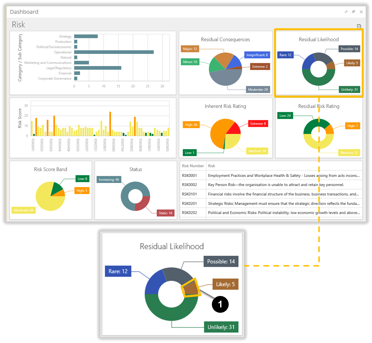
Example: ‘Risk’ Interactive Dashboard
In the ‘Risk’ example below, the user clicks on the ‘Likely’ component of the ‘Residual Likelihood’ Panel (see 1).
‘Risk’ Interactive Dashboard (unfiltered)
The information in all other Panels on the Dashboard is automatically filtered to display only the information for those Risks with a Residual Likelihood of ‘Likely’.
‘Risk’ Interactive Dashboard (filtered for ‘Likely’ Residual Likelihood)
In the filtered Dashboard above:
The Risk List Panel 1 is filtered to display those Risks with a Residual Likelihood of ‘Likely’.
The ‘Category / Sub Category’ Panel 2 is filtered to display only the Categories / Sub Categories of the two Risks in the Risk List Panel 1.
The other Panels 3 through 8 display only those values that relate to the filtered Risks.
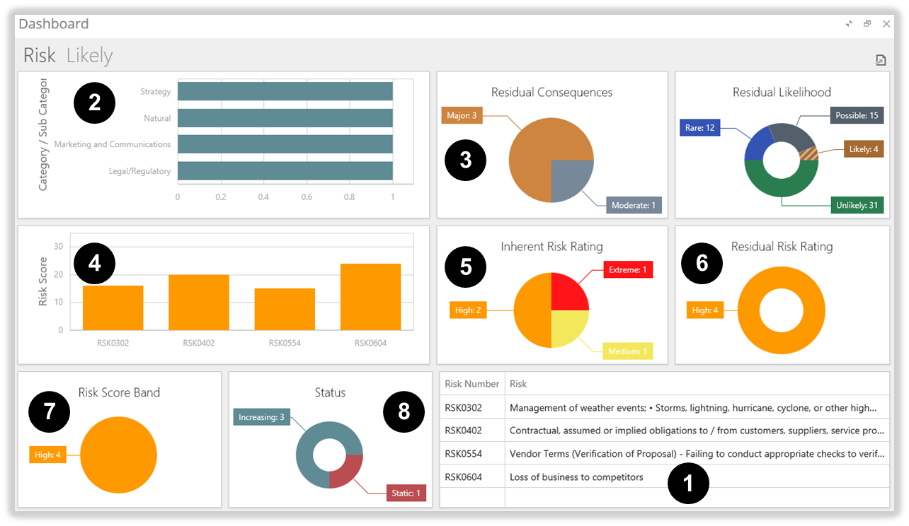
Refining the data further
In the example above, you can click on a value in any of the Panels 1 to 8, and the Dashboard data will be filtered further.
For example, you can click on the ‘Low’ Risk Score Band in 7, and the data will be filtered to display any Risks that have:
a Residual Likelihood of ‘Likely’, and
a Risk Score Band of ‘Low’.
Clicking a value in other Panels will continue to refine the filtered data.
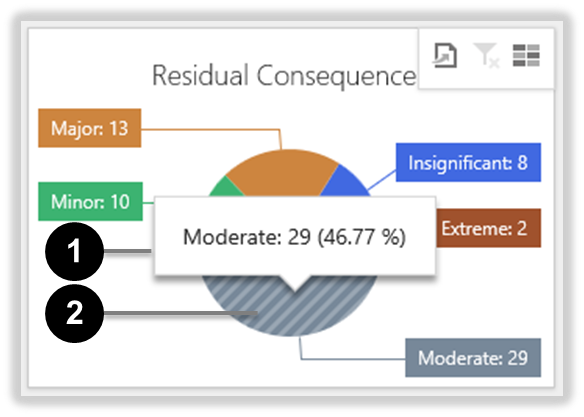
Viewing rollover information
Hold your mouse cursor over any value in an Interactive Dashboard Panel to display more detailed information.
In the ‘Residual Consequences’ Panel below, holding the mouse cursor over the ‘Moderate’ value of the pie chart reveals a popup window 1 with more detail. The pie chart value 2 also gains a striped appearance to show that it is the focus of the displayed data.
Example of rollover information
As you move your mouse cursor over other values on the Dashboard Page, the values' popup windows appear and disappear, while the values change their appearance—the value with the focus becomes striped.
Using Interactive Dashboard filters
Single Filter per-Panel
By default, you can only apply one filter per-Panel to an Interactive Dashboard—simply click a value inside a Panel and the whole Dashboard updates to the new criteria. If you click another value inside that Panel, the old value is deselected and the Dashboard updates to the new selection.
You can click a value in one or more other Panels to refine the Dashboard filter.
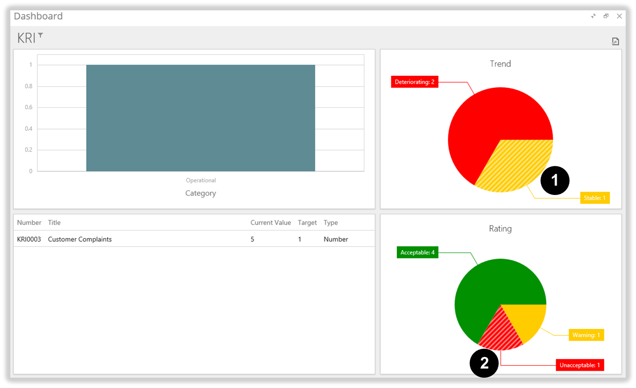
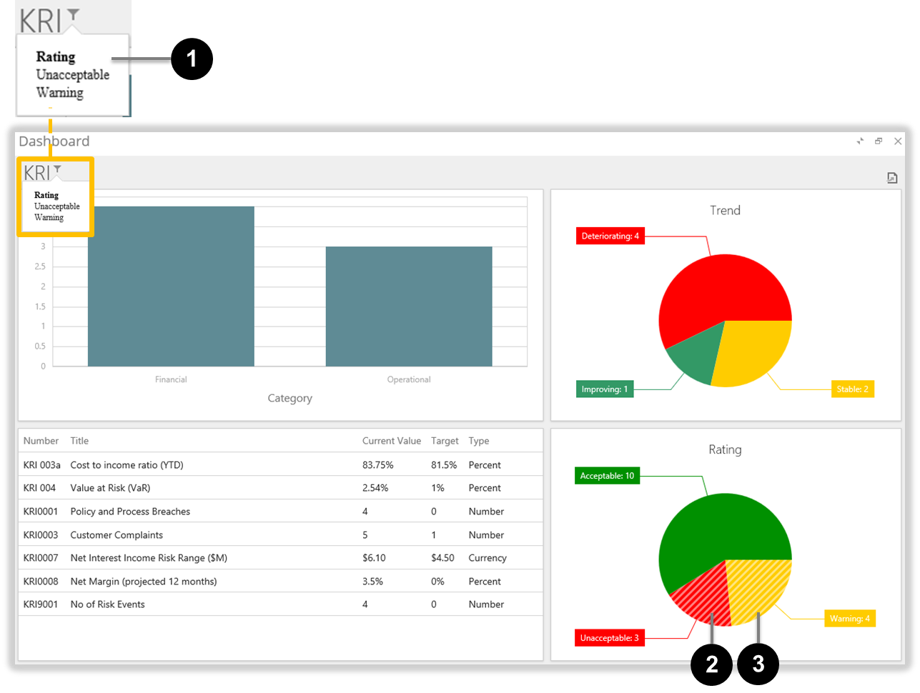
Selected values adopt a striped appearance. In the KRI Dashboard example below, the following values have been selected:
Trend = ‘Stable’ 1, and
Rating = ‘Unacceptable’ 2.
KRI Dashboard selections (one filter per-Panel)
Multiple Filters per-Panel
You can opt to select more than one value within a single Panel.
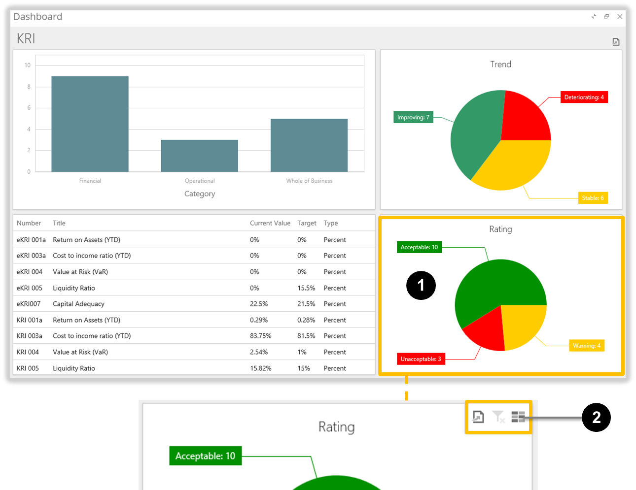
When you move your mouse cursor over an Interactive Dashboard Panel, some filter controls become visible at the Panel’s top-right corner.
In the KRI Dashboard example below, moving the mouse cursor over the ‘Rating’ Panel 1 reveals the Panel Filter Controls 2.
Panel Filter Controls
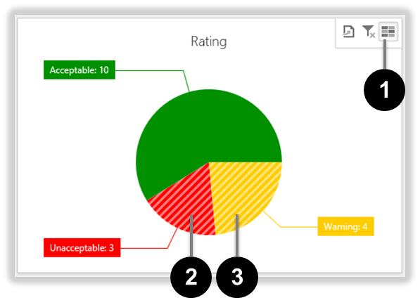
Click the right-most Panel Filter Control to activate Panel Multi-Select mode. You can then click more than one value in a Panel and the Dashboard will aggregate the values instead of replacing the old selection with the new.
In the KRI ‘Rating’ Panel example below, the user has:
clicked the Panel Multi-Select filter control 1,
clicked the ‘Unacceptable’ value in the pie chart 2, and
clicked the ‘Warning’ value in the pie chart 3.
KRI ‘Rating’ Panel with multiple values selected
The Dashboard automatically updates the displayed data as you click various values in the Dashboard Panels.
Note: If you have multiple values selected within a Panel, those values remain selected when you click the Panel Multi-Select filter control 1 to turn Multi-Select off. The next time you click a value in the Panel, all other values will be deselected.
Applied Filters Summary view
Move your mouse cursor over the Dashboard Title to display a popup window with a summary of the applied filters.
In the KRI Dashboard example below, the Applied Filters Summary popup window 1 shows two ‘Rating’ values applied: ‘Unacceptable’ 2 and ‘Warning’ 3.
The Applied Filters Summary popup window (1)
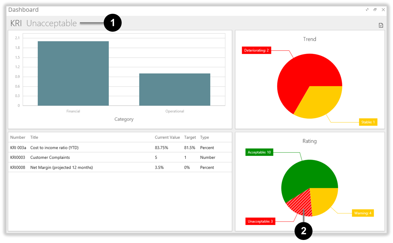
Note:
If there is only one value selected in the entire Dashboard, the selection is displayed as text in the Dashboard Title. In the example below, ‘Unacceptable’ is displayed in the Dashboard Title 1 as a result of the single value ‘Unacceptable’ being selected in the ‘Rating’ Panel 2.
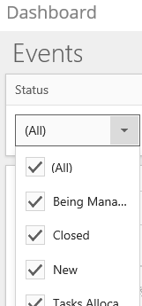
Additional Events Status Filter
Events have the an additional filter that allows filtering by Status.
In the Event Dashboard example below, all Event Statuses are selected to be displayed.
The Event Status Filter dropdown (1)
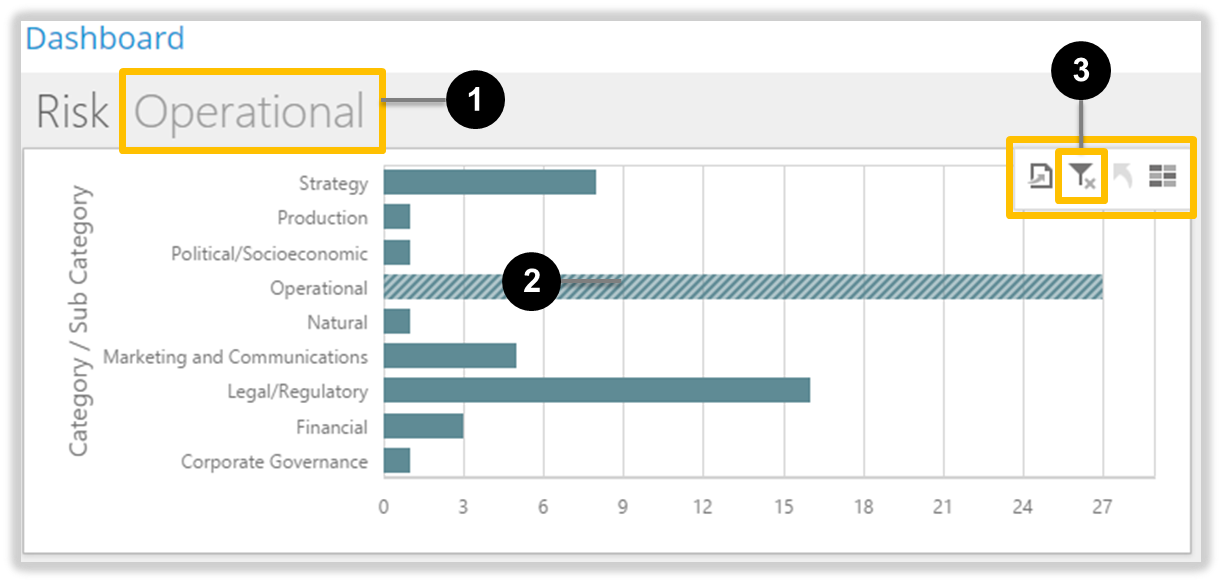
Accessing Risk Sub Categories
Do the following to drill down into a Risk Sub Category.
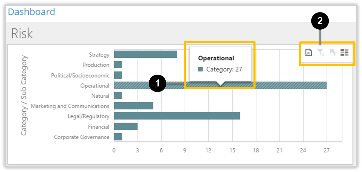
Move your mouse into the Risk Category / Sub Category panel. Click on a Category 1 to apply that Category’s filter; Note the Filter Controls 2 that appear while your mouse is in this panel.
The Risk Category / Sub Category panel
The applied Category filter is highlighted in the title 1, the striped Category bar 2, and in the enabled Clear Master Filter icon 3. Click the same Category bar 2 a second time to access that Category’s, Sub Categories.
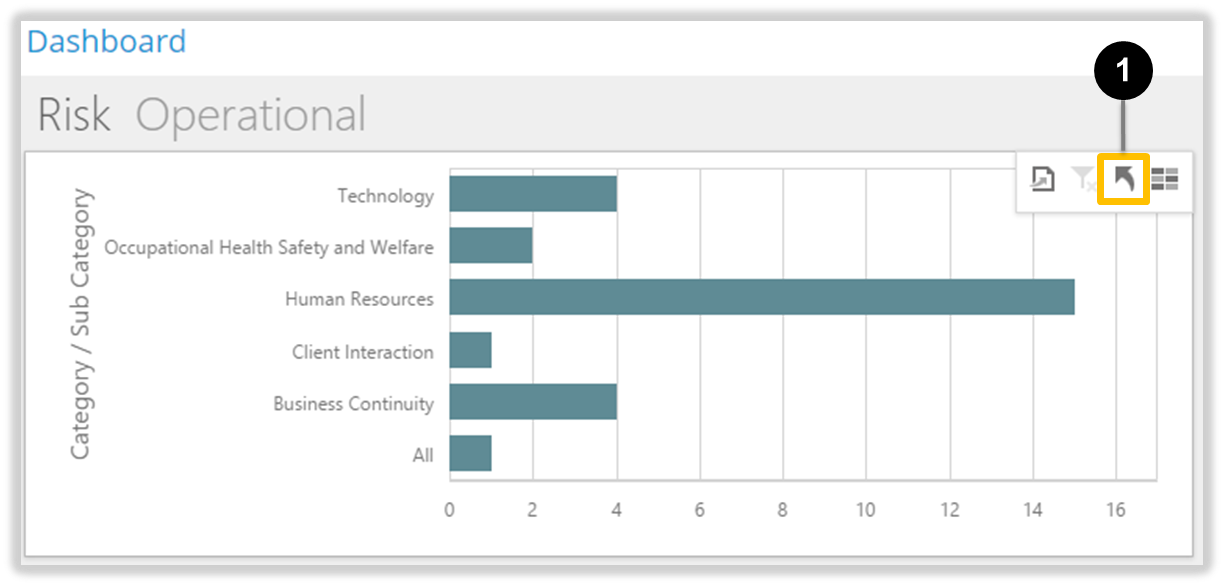
The Risk Category / Sub Category panel
The Sub Categories are now displayed; Note the Drill Up icon 1 is now enabled. Click this icon if you wish to return to the Categories.
The Risk Category / Sub Category panel
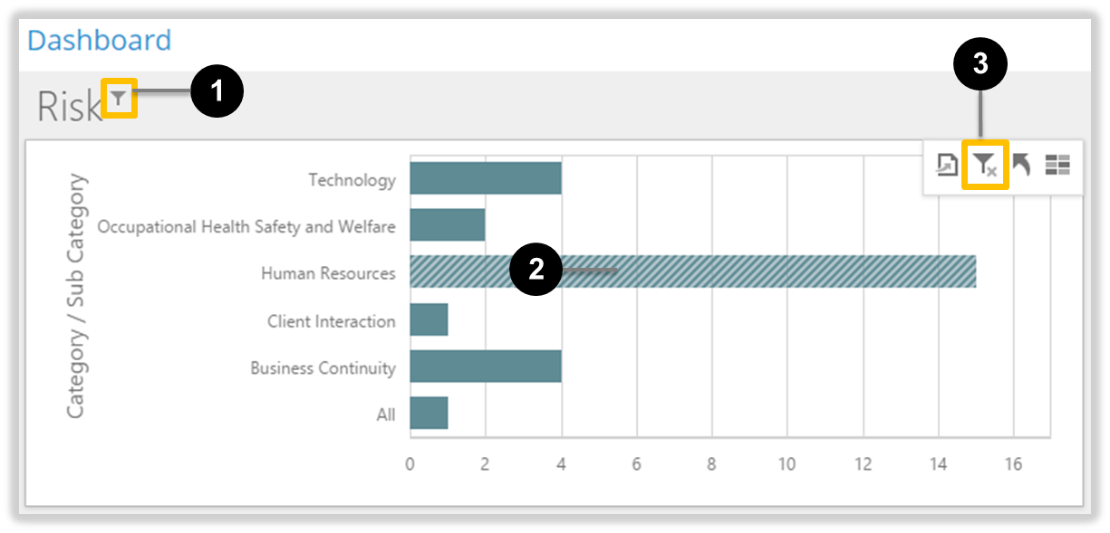
Click on a Sub Category 2 to apply a Sub Category filter. The applied Sub Category filter is indicated by the filter icon 1 in the title, the striped Sub Category bar 2, and the enabled Clear Master Filter icon 3.
The Risk Category / Sub Category panel
Click the Drill Up icon if you wish to return to the Categories.
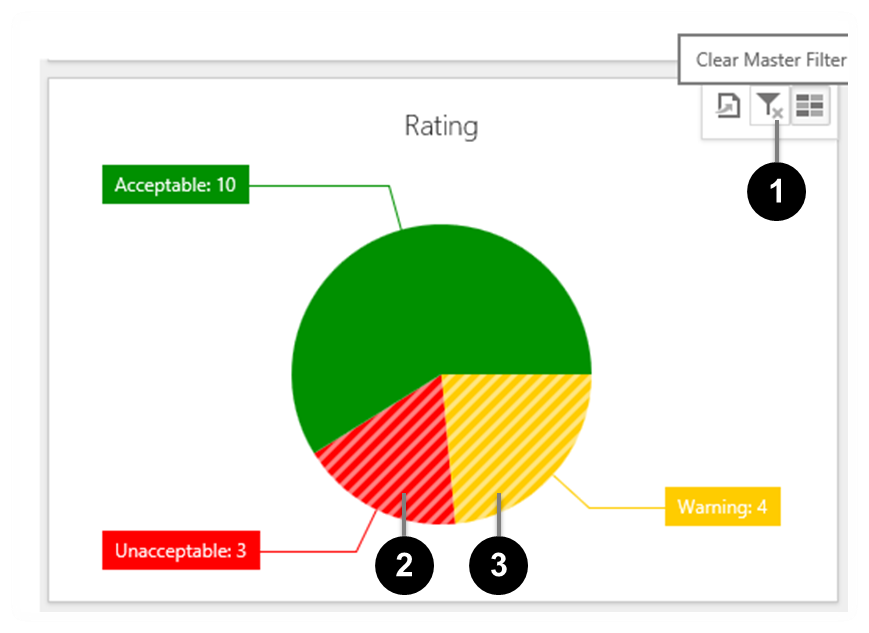
Clear Panel Filters
You have two options for clearing filters within a Panel. Either:
click the ‘Clear Filters’ Control (see 1 below) to remove the filter for all values in the Panel, or
click a selected value (e.g. 2 or 3 below) to remove the filter for that value only.
KRI ‘Rating’ Panel showing ‘Clear Filters’ control (1)
Any value no longer included in the Dashboard filter loses its striped appearance.
If there are no values selected in a Panel, the ‘Clear Filters’ control 1 is disabled (greyed).
Exporting Interactive Dashboard data
You can export the currently filtered Interactive Dashboard to these formats:
.pdf,
.jpg,
.png, or
.gif.
Note:
Due to circumstances beyond our control, export does not retain your custom colours.
Please use a screen Snipping Tool to copy and paste the Interactive Dashboard into your document creator to retain custom colours.
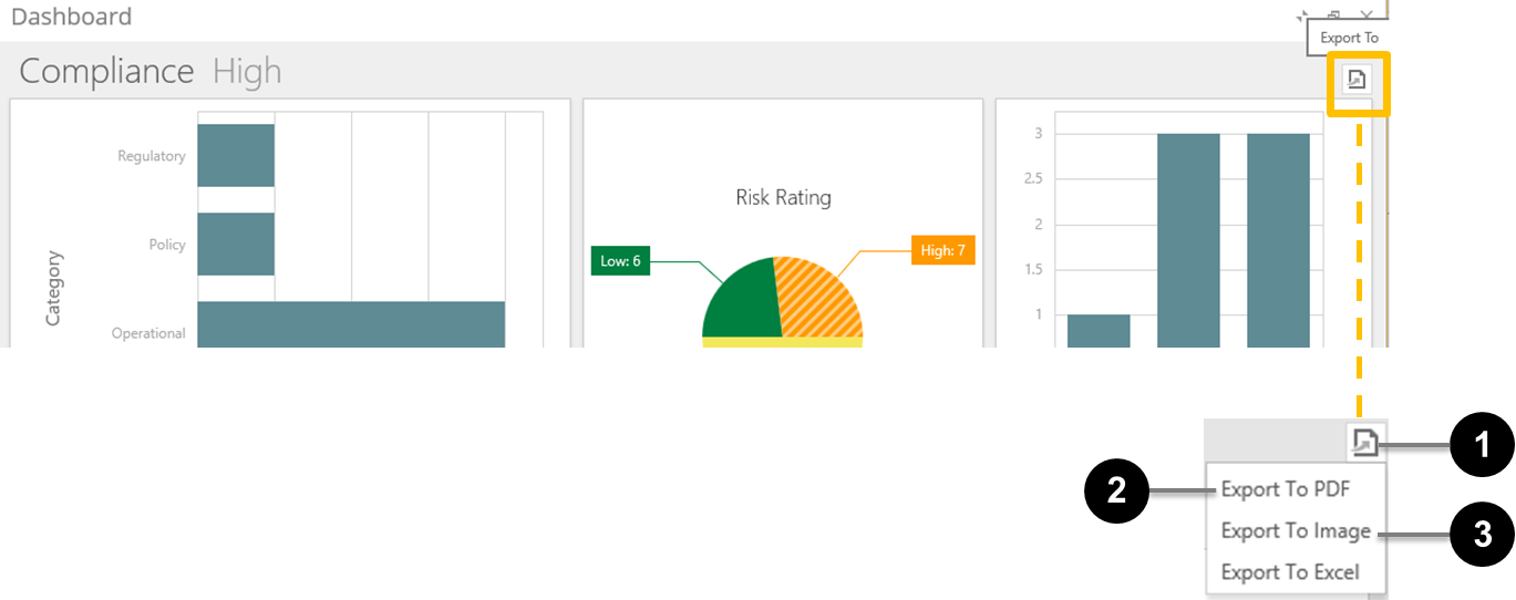
The ‘Export’ icon
The Compliance Dashboard example below shows the ‘Export’ icon 1.
The Interactive Dashboard ‘Export’ icon and choices
Note: The file extension (.pdf) is added automatically on export—don’t include it in this field.
2
‘Page Layout’ options
Choose the page layout for your exported file. Your choices are: ‘Portrait’, ‘Landscape’ and ‘Auto’.
Note: If you select ‘Auto’, the ‘Scale Mode’ 7 field is disabled.
3
‘Size’ Selector
Choose a page size from the drop-down list.
4
‘Show Title’ checkbox
Tick this checkbox to display the Title 5 at the top of the first page of the exported file.
5
‘Title’ field
Type a title for your exported file in this field.
Note: Make sure you tick the ‘Show Title’ checkbox 4 if you want your Title to appear in the exported file.
6
‘Filter State’ Selector
The Filter State is a summary of the applied filters at the time the file is exported.
Choose whether or not you want to include the Filter State in the exported file and where you want it to appear:
None: The Filter State won’t be included in the exported file,
Below: The Filter State will be printed after the other data on the same page, or
Separate Page: The Filter State will be printed after the other data, on its own page.
7
‘Scale Mode’ Selector
If you choose ‘Portrait’ or ‘Landscape’ in the ‘Page Layout’ options 2, choose a scale mode from the drop-down list:
None: Don’t scale the printed output,
Use Scale Factor: Displays an additional field (‘Scale Factor’) to set the scale, where 1 = 100%, .9 = 90% and so on, or
Auto Fit to Page Width: Displays an additional field (‘Auto Fit Page Count’) to set the number of pages that should be regarded as the ‘page width’ (usually ‘1’).
8
‘Reset’ button
Click this button to reset all fields to their default values.
9
‘Export’ button
Click this button to create the .pdf.
10
‘Cancel’ button
Click this button to close the popup window without exporting the data.
11
‘Close’ icon
Click this button to close the popup window without exporting the data.
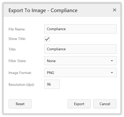
Note: The image file extension is added automatically on export—don’t include it in this field. See 5 for available export image formats.
2
‘Show Title’ checkbox
Tick this checkbox to display the Title 3 at the top of the exported image.
3
‘Title’ field
Type a title for your exported file in this field.
Note: Make sure you tick the ‘Show Title’ checkbox 2 if you want your Title to appear in the exported image.
4
‘Filter State’ Selector
The Filter State is a summary of the applied filters at the time the file is exported.
Choose whether or not you want to include the Filter State in the exported image:
None: The Filter State won’t be included in the exported image, or
Below: The Filter State will be printed after the other data, at the bottom of the image.
5
‘Image Format’ Selector
Choose from three image format options:
PNG: A high quality format, suitable for web use or inclusion in Microsoft Office documents,
JPG: A standard format for web use, or
GIF: A lower-quality format for web use where file size is an issue. (.gif files are typically smaller in file size than .png or .jpg files.)
7
‘Resolution’ field
Resolution affects the quality of an image’s appearance in both displayed and printed output.
If the image will be viewed on-screen only, then leave this field at the default value. To produce a good-quality image for printing from Microsoft Office or similar software, change this field to ‘300’.
7
‘Reset’ button
Click this button to reset all fields to their default values.
8
‘Export’ button
Click this button to create the image.
9
‘Cancel’ button
Click this button to close the popup window without exporting the image.
10
‘Close’ icon
Click this button to close the popup window without exporting the image.
Create and Edit Interactive Dashboards
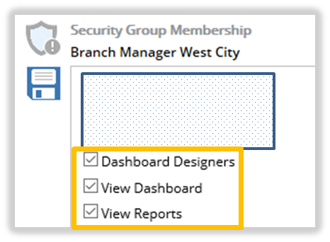
Security Access Required
To access the Create and Edit Interactive Dashboard functionality, the following System Security Memberships are required:
View Reports
View Dashboards
Dashboard Designers
System Group Memberships Access Required
Note: Administrators have access to this functionality by default across all modules. Module Administrators have access to this functionality by default but only in their module.
Records displayed in a Interactive Dashboard are dependent on each users Record security access. Only Records the user can see are presented in the Interactive Dashboard.
The following two Menu Options will become available on each Module’s Main Menu:
Interactive Dashboard Menus
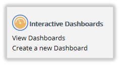
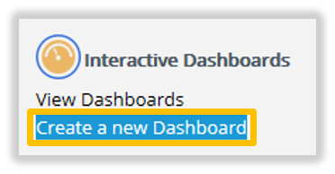
Create a new Dashboard
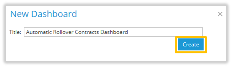
From the module’s Main Menu, click Create a new Dashboard.
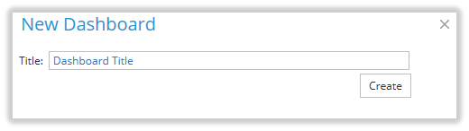
The New Dashboard window will appear.
Enter the Title or name of the new dashboard.
Click Create to complete the dashboard creation process, or click the cancel icon.
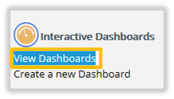
A message will appear confirming the creation of the new dashboard, but the new dashboard will not appear. To see the new dashboard, from the module’s Main Menu, click View Dashboards.
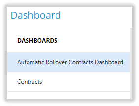
The new dashboard Title will appear in list of Dashboards. Click on the Title to see the dashboard.
Edit in Designer
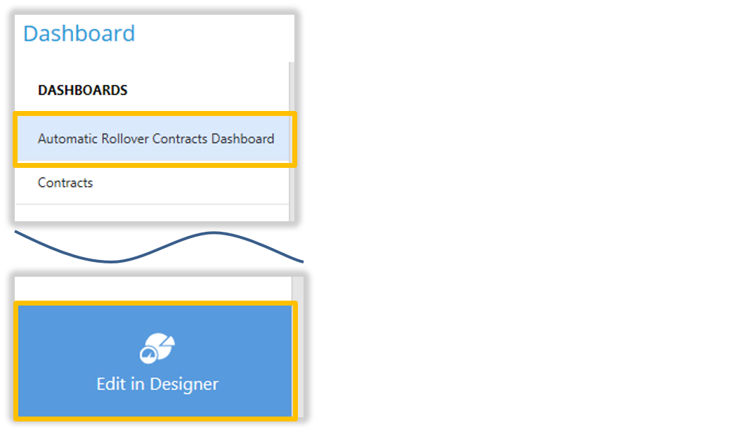
From the module’s Main Menu select View Dashboards.
Click the Title of the Dashboard in the Dashboard list.
Click Edit in Designer.
Edit in Designer
Edit in Designer Menu
The following options are available when the Edit in Designer option is clicked.
Edit in Designer Menu
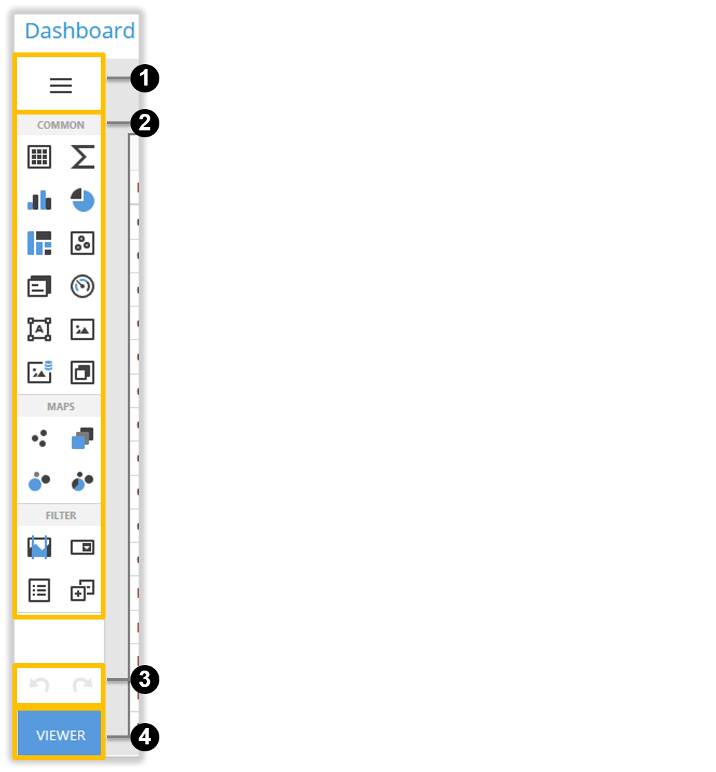
‘Edit in Designer’ Menu elements
ID
Element
Description
1
‘Dashboard Menu’ button
Click this button to invoke the Dashboard Menu. This menu contains elements to save or load dashboards, and to configure general dashboard settings. See Dashboard Menu for more information.
2
Toolbox items
This section contains buttons that allow you to add dashboard items like Grid, Maps, Treemap, Filter Elements Overview or custom items.
3
‘Undo Redo’ buttons
Click these buttons to Undo or Redo an action.
4
‘Viewer’ button
Click this button to return the view mode of the Interactive Dashboard. If there is unsaved work, a prompt will appear to save this work.
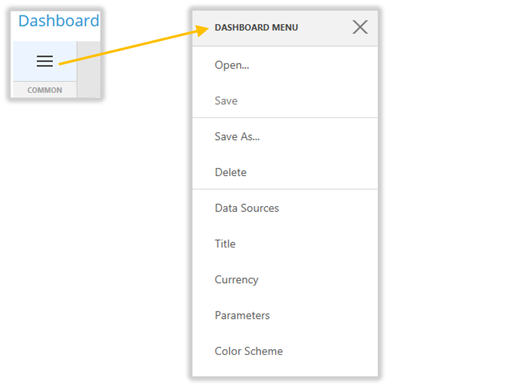
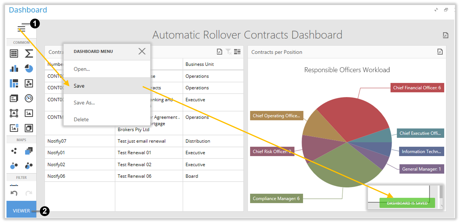
Dashboard Menu
The following options are available when the Edit in Designer Dashboard Menu is clicked.
Dashboard Menu
‘Dashboard’ Menu elements
ID
Element
Description
1
‘Open…’ button
This button allows you to open the existing dashboards.
2
‘Save’ button
Use this button to save the current dashboard.
3
‘Save As…’ button
Use this button to save the current dashboard as a new dashboard.
4
‘Delete’ button
Use this button to delete the current dashboard.
5
‘Data Sources’ button
This button opens the Data Sources page where you can configure dashboard data sources.
6
‘Title’ button
This button opens the Title page where you can set a dashboard title and specify its settings like title visibility, alignment, etc.
7
‘Currency’ button
This button opens the Currency page. Here you can specify the currency format for the entire dashboard.
8
‘Parameters’ button
Do Not change these settings.
9
‘Colour Scheme’ button
This button opens the Color Scheme page where you can customize a global color scheme that provides consistent colors for identical values across the dashboard.
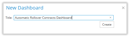
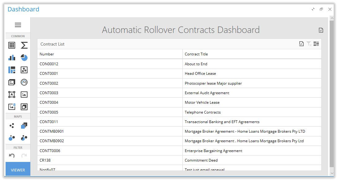
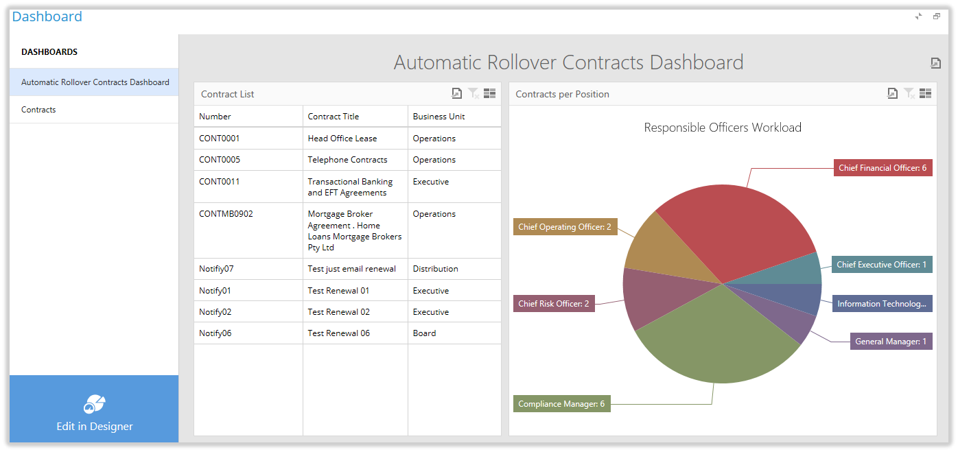
Test Case
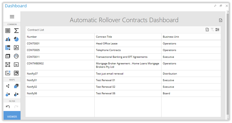
The aim of this example is to create a dashboard that displays information about our automatically rollover Contracts. This dashboard is to contain grid information we are interested in, and a pie graph mapping the number of contracts for each Responsibility Officer.
The Start
We will use the dashboard created in Create a new dashboard. Open this dashboard by clicking Contracts on the main menu, then click View Dashboards. Click the dashboard Automatic Rollover Contracts Dashboard, then click Edit in Designer. The dashboard currently contains a grid with two columns, the Contract Number and the Contract Title.
Initial Created Dashboard
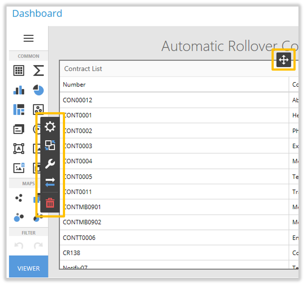
Adding a column to a Grid
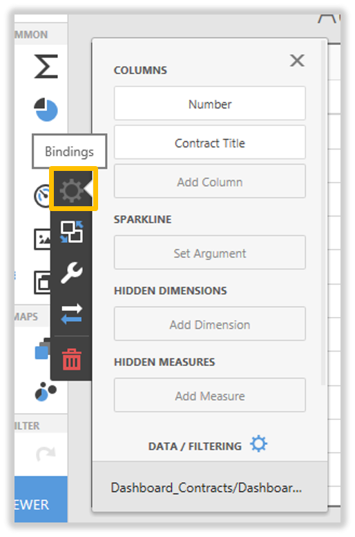
Click on the grid, the Dashboard Item Menu will appear:
Click the Bindings button, the Bindings window will appear:
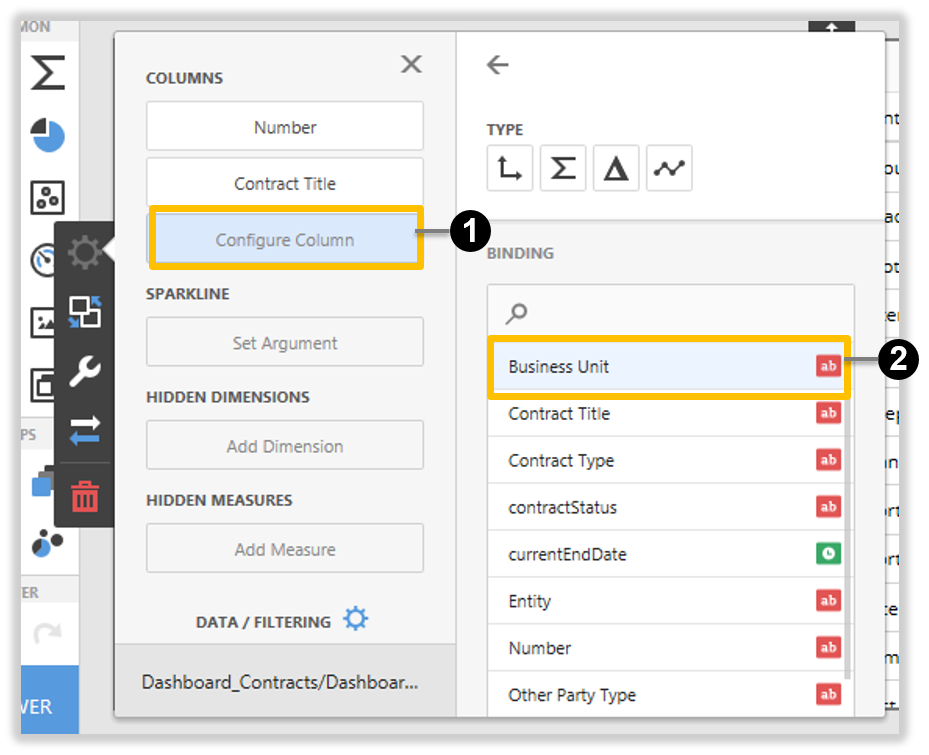
Click Configure Column1, the column Bindings will appear. Click the new column we want to add to our grid, Business Unit2:
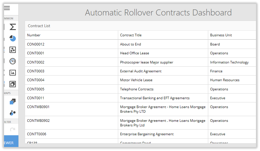
The new Business Unit column appears in our grid:
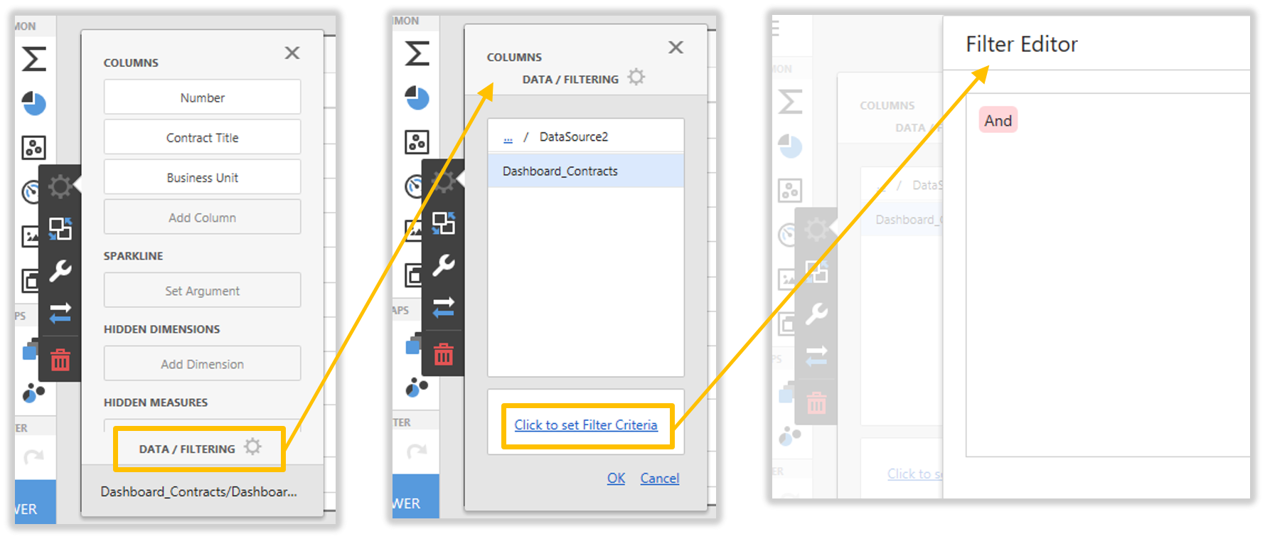
Applying a Filter
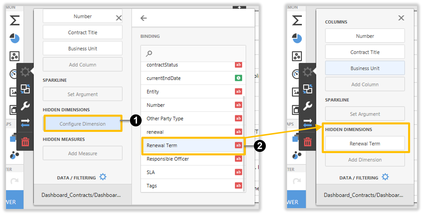
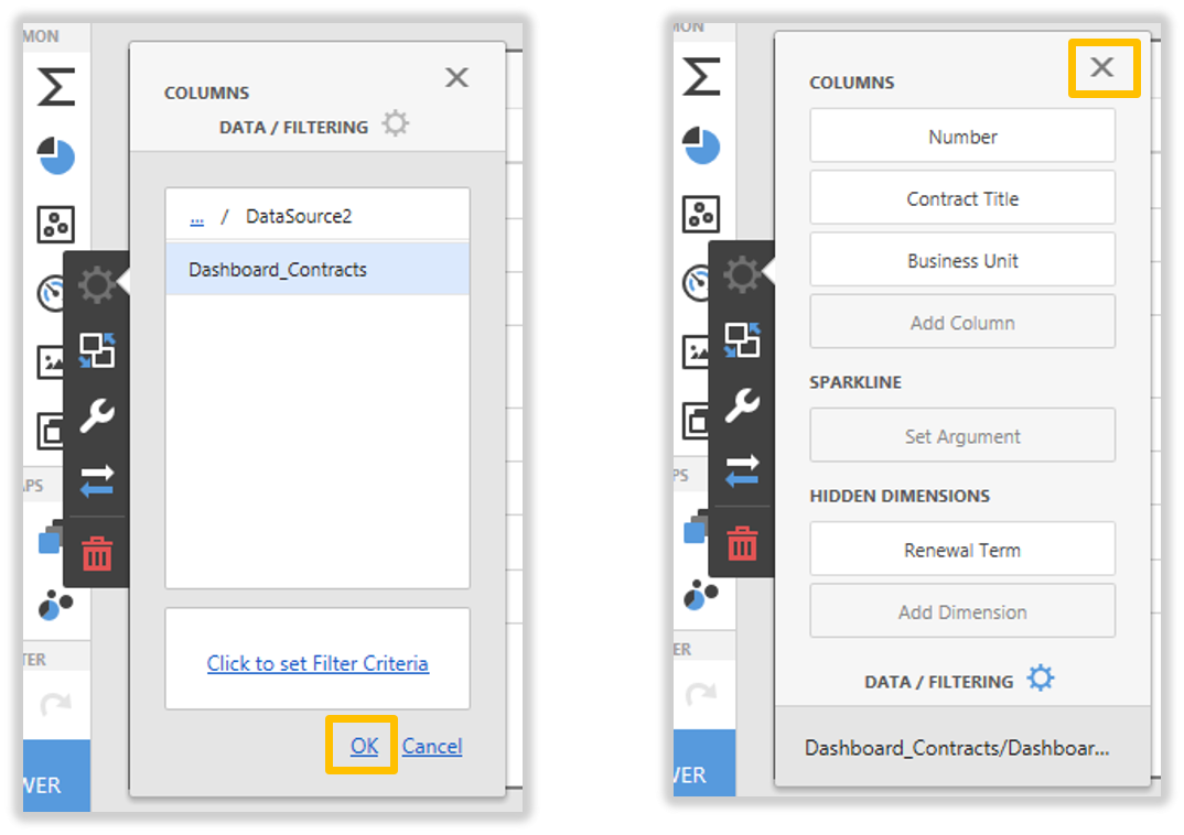
Click on the grid, Click the Bindings button, Click Conigure Dimension1 in the Hidden Dimensions section. Select and click the Renewal Term2 column. Renewal Term appears in the Hidden Dimensions section. We will use this non displayed column to apply filtering to the data.
Click on the grid, Click the Bindings button, Click Data/Filtering. Click Click to set Filter Criteria, the Filter Editor appears:
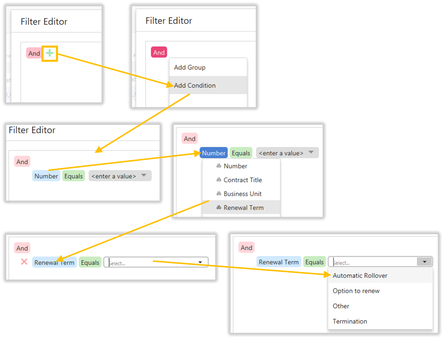
In the Filter Editor, click the green plus, then select and click Add Condition. The condition line appears. Click Number, then select and click Renewal Term. Renewal Term replaces Number. Click <enter a value> (taking care to not click the dropdown), the edit cursor appears (with Select…), now click the dropdown, then select and click Automatic Rollover. The following diagram displays this whole procedure:
The completed condition to filter only Automatic Rollover Contracts displays. Click OK to complete the filter, or click cancel.
To close the Binding menu items, Click OK, then click the close icon:
The records in the list are now filtered to only displayed Automatic Rollover Contracts:
The first half of the dashboard is now completed. We have a grid with the columns and records we want displayed.
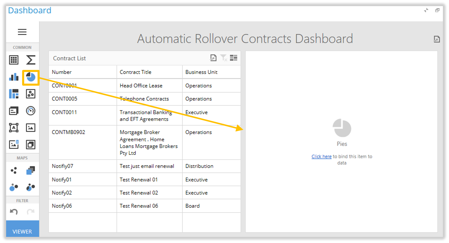
Adding a Chart
The next part of the example is to pie graph the number of Contracts each Responsibility Officer has.
Click and drag the Pie Graph icon across to the right hand side of the window till the blue line highlighter is only on the right hand edge of the grid; release the mouse click to drop the graph into this position. The graph appears empty:
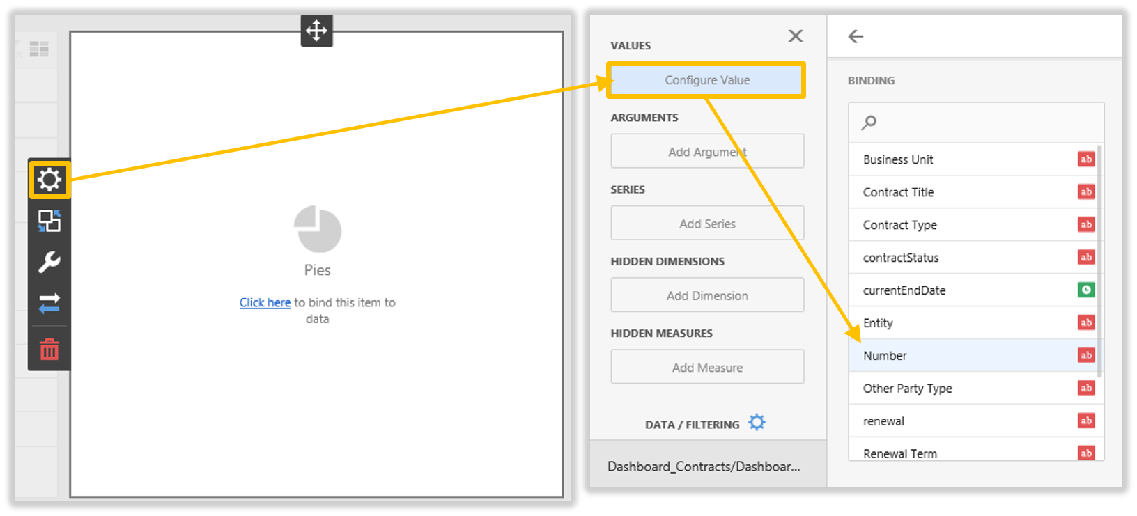
Click Click here to Bind this item to data. When the Binding window opens, click Configure Value, then click Number. This selects a value that will count the Contract records we will be graphing in the pie chart.
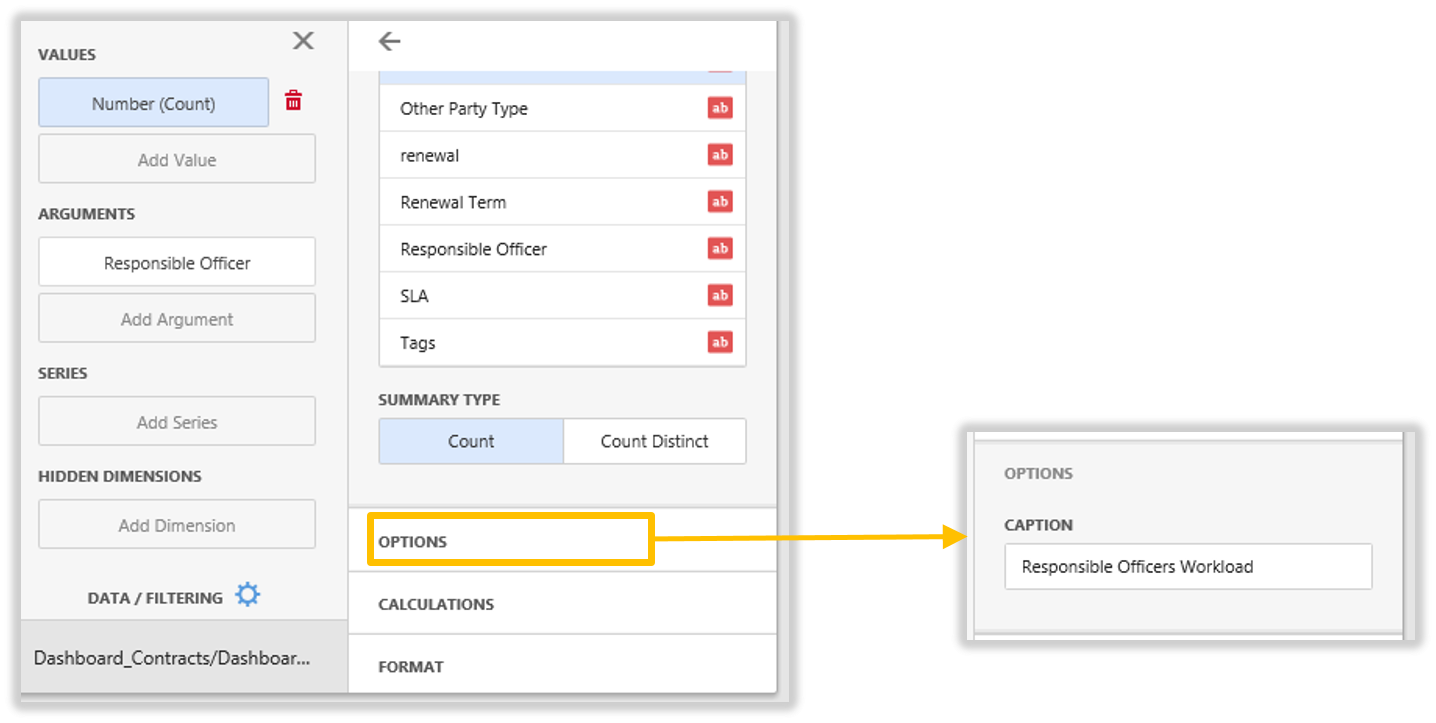
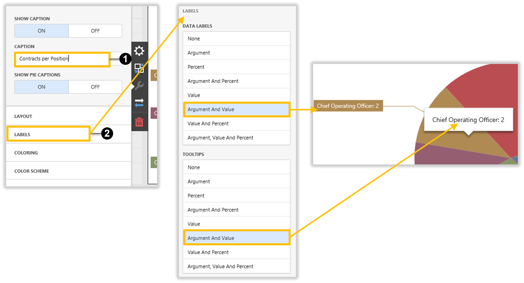
Click Options and enter the description of number (“Responsible Officers Workload”) we graphing in the Caption field:
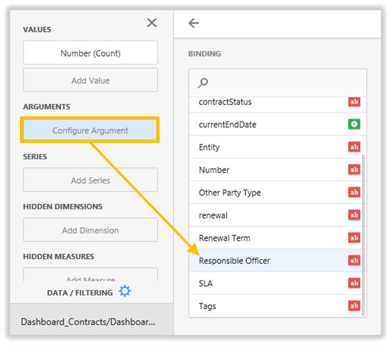
Add the argument will want to graph. Click Configure Argument, select and click Responsible Officer:
Close the Binding’s window to see how the new graph current looks:
Click the Options (third/spanner) icon, enter the caption of the pie graph in the Caption field 1. Click on the Labels section 2 and click to select Argument and Value in both the Data Labels section and the Tooltips section. This displays on the pie chart the Responsible Offer and the number of Contracts each Offer has.
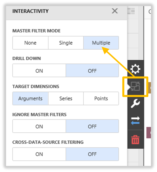
Now we want to make the pie chart interactive to our grid, this will allow filtering to work between both elements. Click on the Interactivity icon, select and click Multiple in Master Filter Mode section.
Now lets save our work and view the final product. Click the Dashboard Menu button, then select and click Save. A message will display that the Dashboard is Saved. Click the Viewer button to exit Edit in Designer mode and return to Viewer mode.
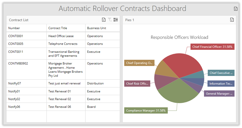
The Completed Dashboard
Our completed dashboard displays a grid of the Contract information we want to display, filtered by the Automatic Rollover Contracts. The pie charts shows which Responsible Officers have these contracts and how many each has.
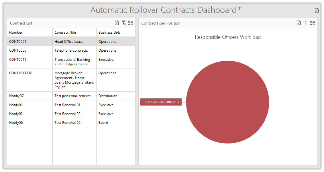
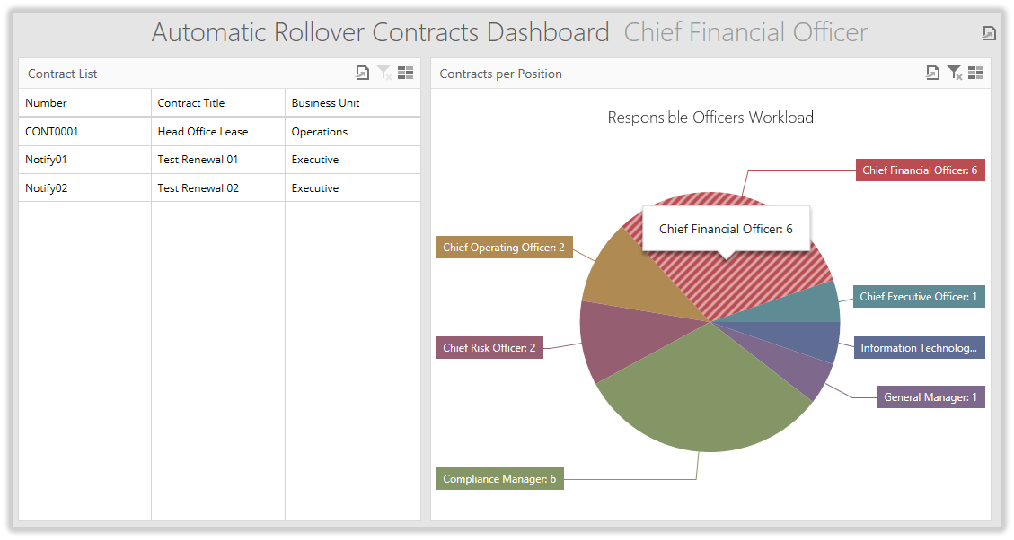
If we click on a record in the grid, the pie chart filters to that record.
Conversely, if we clear that filter and apply a filter to the pie chart by clicking on any piece of the pie, the grid filters to display on those records relating to the select Responsible Officer.